
Could it be true that if we paint one hand yellow and the other hand blue, we feel the temperature difference in each hand? Can the eye see if you can feel the difference. And if we were in a room where everything is yellow, what would happen? Do we feel the same as in an entirely blue room? For a while was the wall of my room yellow and to me it seemed that the sun always shone.
Are the colors than magic, whether they affect our sense temperature? Is it subjective? It is possible that it can be subjective reality and can become something physical. Does it feel warm that what we believe (spirit) or that what we feel (senses) How can we play with this? Control the color and know the power of warm and cool colors.
“I try to apply colors like words that shape poems, like notes that shape music.” – Joan Miró (1893 – 1983), artist.

Warm and cool colors
If we halve the color wheel, from green to violet, we distinguish between warm and cool colors. The green and violet may be warm as cooling, depending on the amount of yellow and blue that they contain. Warm and cool colors complement each other. The complementary color, the color that contrasts, is on the other side of the color circle.
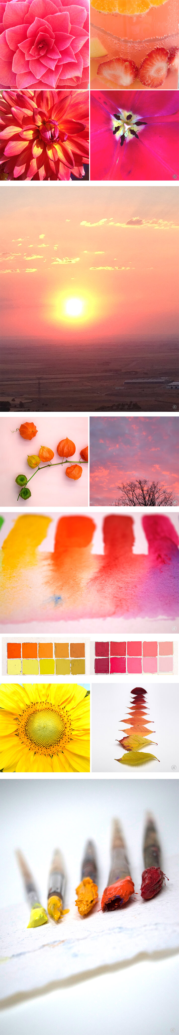
Warm Colors
The warm feelings associated with fire and the sun. Warm colors are those colors that range from red to yellow, through orange, brown and gold. Warm colors are more striking and dynamic. It is usually said that the more red is a color in its composition, the hotter it is.
These are the colors of passion, sunset and autumn. This type of color tones express closeness, warmth, comfort and activity.
Warm colors are used to display the following as
– enthusiasm
– passion
– joy
– energy
– They encourage the viewer
Colors have fixed connotations, with a sense. For example, red blood, yellow is the sun. Other associations are based on tradition and culture, red communism, socialism, the red cross. The taps discern temperature differences over the color. Red indicates hot water and cold water is blue.
The hot and cold feelings also affect the illusion of space. Warm tones tend to come close to us, creating smaller and cozy spaces.
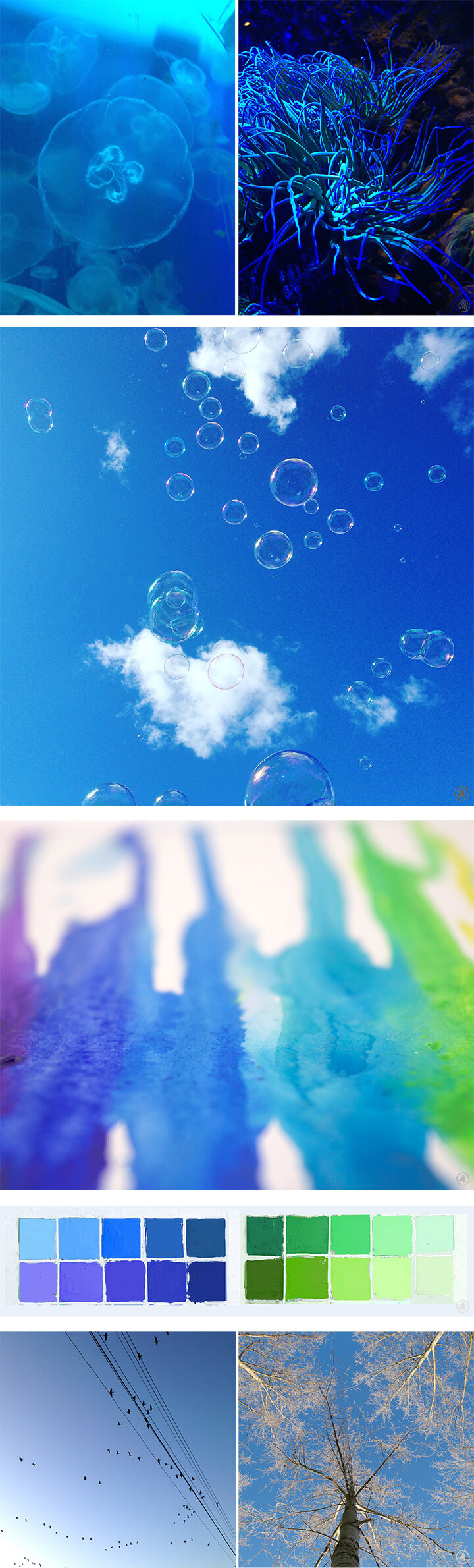
Cool colors
A cold feeling is achieved by the presence of tones that have a connection with water or air. Cool colors are all colors ranging from blue to green through the purple. The more blue has a color, the cooler it will be. Cool colors are the tones of winter and the night, takes us to landscapes, seas and lakes, nature. The psychological effects they create are calming, rest, relaxation, solitude and mystery.
Cool colors are used to display the following:
– passivity
– serenity
– remote
– Sensation of cold
– professionality
Blue is associated in many cultures with the divine and eternal (air and sea). It is related to the sport, living in air, cleaning, freshness. fantasy and utopian ideas. The green refers to the clean technology and green energy.
The colors affect the area, cool shades create distance. If you see a mountain landscape, it is “blue” that’s a little further away. The cool shades, you can create depth.
In the same color are warm and cool tones
Within each color, there is a wide range of hues that are perceived warmer or cooler. For example, between the yellow and green colors are ranges that difference from warm to cool yellow, warm green to cool green.
In addition, a color more or less warm or cool depending on other color that you compare them. A lemon is relatively cooler than an orange, but both are relatively warmer than blue.
Therefore, the temperature of a color tone is a characteristic that varies depending on the context, the colors of which it is compared.

Neutral colors
Not all colors are warm or cold. Achromatic values such as white, black or gray are considered neutral, neither warm nor cool. In landscape painting, the gray often associated with clouds, rain and low temperatures, and therefore this is often incorporated into the cool color palette.

Hybrid colors
Hybrids are the color tones of which the composition is made by mixing of both warm and cool colors. This is within the range of green and purple; yellow and blue; magenta and blue. Both colors have a common tendency to blue.
Saturation affects the perception
Saturation affects the warm or cool perception of the color. Saturation is determined by the purity of the color. High color saturation is lively and intense. Recent research suggests that it is not the color temperature that causes these effects, but the brightness and the saturation. This explains why brown color (warm, dark and low in saturated) do not cause specific effects of the warm colors, but blue cyan (cold, light and lively) appears happier and more energetic than the brown.
When grayscale is different, a little saturated hues are seen warmer than the same show with high saturation.
How the light source affects the color
There is one element to be taken into account when looking at the color, the light source. A color varies depending on whether the natural light, an incandescent lamp or fluorescent light. This light gives a greenish glow, incandescent yellowish.
I would like to paint the preferred daylight, because the contrast between the colors is difficult to estimate with artificial light. The color of the light is also dependent on the height of the sun. It has a yellow or reddish tinge during sunrise and sunset, and a bluish tinge in the afternoon. The weather changes play an important role during a day.
“Someone who aspires to be a “master” in the color, must feel and experience every color in its endless combination with all other colors” – Johannes Itten (1888 – 1967), painter.
Sources
“Beeldende begrippen” Bert Boermans. Uitgeverij LAMBO
http://arte.about.com/od/Que-es-el-arte/fl/Temperatura-del-color-caacutelido-friacuteo-y-neutro.htm
http://arte.about.com/od/Diccionario-De-Arte/fl/Colores-calidos.htm
http://www.estiloambientacion.com.ar/colorescalidosfrios.html
http://www.gruponexcom.com/blog.php/?e=30
http://www.muchosleds.com/es/content/6-temperatura-de-color-calido-neutro-frio
http://www.muchosleds.com/es/content/6-temperatura-de-color-calido-neutro-frio
https://es.wikipedia.org/wiki/Temperatura_de_color
Texts, photo’s and art: Ángeles Nieto


No Comments