
I like very much to enter a shop with art materials, all the colors are nicely arranged in the showcases, it’s for me like a candy store for a kid. You know the feeling to go to a crowded market with fresh products, thinking about the dish you are cooking later; when entering an art materials store I feel the same. Color is a key for visual artists, it is necessary to recognize this and to control, color gives you creative freedom and educates the eye. Color communicates the emotion expresses. Mixing colors helps to understand this language. It’s like a game. By experimenting, you learn to see the mechanisms. Think that you are in the kitchen and you see the ingredients and flavors together and you will mix them as you can do with colors.
“Color and I are one” Paul Klee (1879 –1940), painter
What is color?
Kleur is light!
Color is a visual perception, an impression that we receive through the eyes and is interpreted by the brains. This phenomenon is produced by beams of light falling on illuminated objects. It is similar to the vibrations in the air of sounds. Light is realized from waves, light waves. All the exposed objects absorb some of these electromagnetic waves whose remainders are reflected. For example, a ultramarine blue pigment reflects blue light, and absorbs other colors. The reflected waves are what our eyes see and what our brains interpret. Each color has its own wavelength. “Although color is regarded as a property of objects, in fact there is not a single object colored.” Sara Lasso. The human eye can only see the waves with enough light. In low light you see in black and white.
How can you mix colors?
or centuries, artists have tried to understand the variations of colors and they experimented with mixing pigments looking for a recipe of color. So was born the color theory, a set of rules, including the color wheel.
1) The color wheel
There are different colors circles, based on the color of light (CMYK) or pigment color (RGB, RYB). The latter I will discuss, this is a traditional color system that also applies to painting. The color wheel is a circular orderly presentation, where the primary colors are displayed and its derivatives. The color wheel is a useful tool to create new colors and to establish harmony in color combinations.

Primary colors
In the search of artists to make a color guide, it was concluded that there are a small number of pigments, called primary colors (yellow, red and blue) with that you can build the rest of the colors. A property of these primary colors is that they themselves can not be created by mixing with others.
This traditional view is not entirely correct. With yellow, red and blue, it is impossible to create the full range of colors. Especially the secondary colors are limited, especially the purple and green, which are matt and more grey.
Further investigation into the physics (light) and biology (eye, brains) have defined the true primary colors, using in place of the blue and red, the cyan and magenta.
Primary colors: Yellow, cyan, magenta
Secondary colors
The secondary colors are created by mixing two primary colors. The secondary colors are orange, purple and green.
Yellow + Magenta = Orange
Magenta + Cyan = Purple
Yellow + Cyan = Green
Tertiary colors
These colors do you get by mixing the secondary colors.
“Color is the place where our brains meet universe”.
Paul Klee, (1879 – 1940), painter
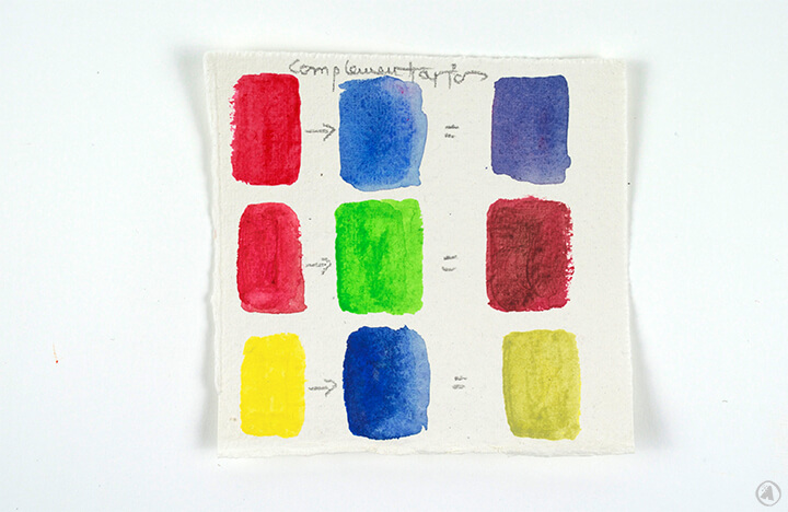
2) Gray and gray-like colors
In the color circle appear saturated tones (pure and intense colors). These colors can be made neutral, grayer, valer by mixing this color with its complementary color.
Complementary (contrasting) colors are the colors that are located in the opposite position in the color circle.
Yellow ………. purple
Magenta ……. green
Cyan …………. orange
3) Clarify color
– Mix with white
White is used to clarify colors and to make pastel colors. Mixed with white colors become brighter, but they also lose saturation (intensity) and are then grayer.

– Mix with bright colors
You can brighten the colors when you mix them with other bright colors, no white. In this manner, the saturation (intensity) is held in position, although there is a change to the color. For example, if you want to make brighter orange, mix it with a lighter color, such as yellow, the color will change to a yellow-orange, it will be clear. If you want to illuminate red, it will become, mixed with white, pink. In combination with yellow it will keep the intensity, now slightly lighter red orange.

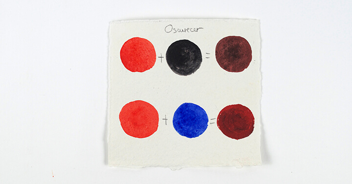
4) Make colors darker
– Mix with black
The easiest way to darken other colors is with the use of black, The downside is that by the use of black the color becomes darker, dirtier and opaque.
– Mix with other dark colors
I do not like using black to darken other colors. I replace this with very dark shades like ultramarine blue and vermilion red.
5) White and black
The black is the mixing of all the colors. With the three primary colors evenly, yellow, cyan and magenta, you get black. The disadvantage is that this can be somewhat greyish. Do you want to get it darker than you need to add a bit of ultramarine blue or vermilion red. White can not be mixed. The brightness of white can not be made with other colors. Do you want to know more about white: “THE KEYS TO THE COLOR WHITE” https://www.angelesearth.com/art-techniques/the-keys-to-the-color-white/
6) Brown
The easiest way to get brown is to mix the three primary colors, but not equally. Brown also is created by mixing green and red. Depending on the type of brown that you want to get you will need to vary the proportions.
7) Tips
– Organize the colors on your palette. I put the cool colors and warm colors separately.
– Make your brushes clean so you will not pollute a new mixing with previous tones.
– Use small amounts of paint.
– Some colors are “heavier” such as red. If you are using such a color in mixing do it in small quantities.
– Create a custom color circle. That’s a good point of reference.
– What colors should you buy? Previously I’ve written an article on this topic: BASIC INGREDIENTS FOR COLOR RECIPE https://www.angelesearth.com/workbook/basic-ingredients-for-color-recipe/
– Play and practice.
Exercise: PLAY, WHAT IS THE COLOR RECIPE? https://www.angelesearth.com/personal/play-what-is-the-color-recipe/
Learning about color properties is a matter of experiment. What is your experience with color? It is a fascinating world and it is certainly possible to master. Start the adventure and enjoy it.
Photo’s, text, illustration: Ángeles Nieto en Julia Vossen

Bronnen:
– “Beeldende begrippen” Bert Boermans. Uitgeverij LAMBO
– http://conceptodefinicion.de/color/
– http://arte.about.com/od/Diccionario-De-Arte/ss/Que-es-color.htm
– https://es.wikipedia.org/wiki/C%C3%ADrculo_cromático
– http://arte.about.com/od/Fotos-de-arte/fl/Como-hacer-colores.htm
– https://es.wikipedia.org/wiki/C%C3%ADrculo_cromático
– http://talento.doncomos.com/como-hacer-colores-para-pintar
– http://www.milideas.net/como-mezclar-colores-usar-tintes-o-colorantes-para-obtener-colores


No Comments